Sunday, December 28, 2008

Christmas Commissions

Finally I can reveal the work I did for Christmas gifts. These first two are woodburnings done on commission. Ollie is a Welsh corgi, an adorable fluffy breed of dog in my opinion. Because of the light color of his coat, I decided a dark background would bring him out more. I'm not sure if Kahlua is any particular breed or a mix, but his dark coat made it easier to leave the background plain. I loved the floppy ear!

Merry Christmas!

Saturday, December 20, 2008

Making Mistakes and Learning a Lesson

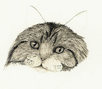
bobcat drawing in progressThe drawing here is the beginning of a bobcat. I'm using smooth bristol paper with charcoal and using what I've been calling "the indent method" to an extreme. I'm quite pleased with how it started out, but unfortunately, I really messed up those whiskers over the eyes so I'll have to start over. This was gearing up to be my best work yet, but I just couldn't fix them. I tried a new technique and it didn't work. What can I say. That's how you get better, by taking chances and making mistakes.

So what did I do? I used an empty mechanical pencil to indent the paper where the whiskers will go. Usually, the charcoal glides over it leaving the indent white (my next drawing tip will be a detailed explanation of this technique). Instead, I decided to use a chamois with charcoal dust on it to dab charcoal onto the paper and get an interesting background texture. Well, the indents must not have been very clean, because the charcoal and even some chamois fibers got stuck in them. No amount of erasing and reindenting and redoing could correct it. I'm just glad I didn't do more of the cat before starting the background, or I might have lost a lot more time.

Drawing Tip #17: Use the Right Paper

When I started doing charcoal work back in January, I didn't really know what kind of paper to use. After some other artists' recommendations, I bought a pad of 14"x17" Strathmore bristol vellum. Vellum is a textured paper that holds onto charcoal very well. I've been using that paper all year. Then I heard that you can get much more detail out of smooth bristol paper, so I bought a small 9"x12" pad of that to try. What a difference! Even the charcoal works wonderfully with it. I'll definitely be getting larger sizes of this paper for future work. I like the bristol paper because it is thick and sturdy, doesn't wrinkle, holds repeated erasings and many layers of drawing, and is acid-free. Of course, there are many other kinds of drawing paper out there that will give similar results.

Ultimately, you need to use paper that is suited to your subject and your technique. Drawing on textured paper will end up with a textured look, which is why I think the vellum worked well for my animals. Smooth paper is better for people and other smooth subjects, and is also much easier to get detail onto.

Monday, December 15, 2008

Holiday Craziness

I really didn't intend to go so long without a post, but things have been just so busy lately! I've had three Christmas commissions (which I will post after Christmas) and wanted to get them done in time for shipping. Also, a few days before Thanksgiving my 2-year-old daughter decided she doesn't want to nap anymore. This took away my largest block of art-time. The good news is she loves to draw, too. I set up her kid-sized table and chairs with her pad of paper and box of markers and crayons, and my table-top easel on the kitchen counter, and we draw together.

So now that I have shipped off the last of my Christmas gifts, I will have a little more time to devote to my own art. I'll be starting the zebras soon and working on the coral reef more, and I promise I will get another drawing tip posted in the next couple weeks. In the meantime, I'm going to enjoy the snow and try to relax.

Wednesday, November 26, 2008

Sand Cats

sand cats graphite pencil drawingMy daughter was getting National Geographic Kids for a while, and occasionally in an issue they would include these animal fact cards with lesser-known animals. One day, an issue came with card of a sand cat - a very small wildcat from the deserts of Africa and Asia. I had never heard of them before, but the photo was just adorable! Growing to only 5-7 pounds, these cats are nocturnal, sleeping in burrows during the heat of the desert day. They are not endangered.

This drawing was done with only graphite on smooth bristol paper. I have been using bristol vellum for most of my work, and wanted to try out the smooth version. I like it very much, but the real test will be when I try charcoal on it. Because of its smooth nature, there is not much for the bits of charcoal to grab onto. My test scrap shows promise, though, and perhaps one of my next charcoal drawings will be done on this new paper. In the meantime, however, I still have a commission to finish before Christmas and several in-progress pieces on the table first.

Have a very happy Thanksgiving!

Monday, November 17, 2008

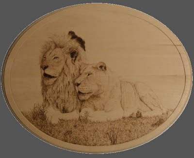
Woodburned Lions

white lions pyrography woodburning drawing
I finished this piece about a week ago, just before I went on vacation. It is the first pyrographic work I have put on this blog, but it won't be the last. I have several others in planning phase, and I need to buy some more wood.

My original plan with these lions was to extend the dark background almost to the edge and have it wrap under the grass area. I carved a groove where the edge of the burning is now, so there would be a thin light line around. But when I got to this point, I liked how the unburned wood acts like a frame, so I left it as it is.

The original 14"x11" piece is available for purchase.

Wednesday, November 05, 2008

The Tools of Pyrography

pyrography burnerSince I started posting my pyrography in progress, I wanted to show the tools I use to make these works. First, there is the power unit. I use a Razertip system with a single pen (double pen systems are also available). There is a power switch and a heat setting from 1 (just warm) to 10 (red hot). The pens are plugged in and there is a holder on each side to secure then pen when you are not using it.

pyrography pensThere are many types of pens, but I have these six. The power unit came with the regular skew, which is like a knife. Because it is so large, I don't use it much. I prefer the small round skew which is easier to manipulate and to make curved lines. Skews are sharp and will actually cut into the wood with enough pressure. There are two shaders, flat and spoon shaped. The flat shader is best for getting a nice, even tone in a large area, while the spoon shader works best for smaller areas. The writer is made for just that - writing. It creates a thick but easily maneuverable line. I like the ball pen for detail work and signing my name. It, along with the small round skew, are my two favorite pens.

Learning to do pyrography is like learning any new medium. It takes a lot of experimentation to figure out what works and what doesn't, but once you get the hang of it, the results are rewarding.

I'll be offline all next week, so hopefully I'll be able to post my finished lion pyrography when I return.

Friday, October 31, 2008

The Art of Pumpkin Carving

I'm starting to be known as the one who always has the great jack-o-lanterns. This year I took the easy route with a simple carving (hard to do it with a 2-year-old running around). But the truth is, if you can draw, you can carve a unique pumpkin. There are a couple things to keep in mind, though:

1) Pumpkin carving is a lot like using white charcoal on black paper - you start with a black background and carve away the light parts. If you want to carve something dark, like a black cat, you have to surround it with something light, like a full moon. This year, I carved a slight variation of my Moonrise Message, a raven silhouetted against a full moon.

2) Also important to keep in mind is that you can have a light patch by itself, but all dark patches must be connected to another one and ultimately to the rest of the pumpkin. Otherwise, the piece will just fall out. This can be tricky. Last year (and I really wish I had a good photo of it) I carved a tiger face. It was quite a challenge making sure all the stripes and the nose and eyes were all connected.

3) Carve the details first, and make sure the thickness of the pumpkin wall works with the level of detail. A simple jack-o-lantern face can get away with thick walls, but if you have very thin parts, like branches or a raven's beak, a thinner wall is necessary (otherwise, the thickness can be misconstrued as part of the design). By carving out the details first, you have more of the support of the rest of the pumpkin to keep the piece steady. And carve away large blocks last, pulling out smaller portions at a time instead of the whole thing at once. For my raven, I carved between the legs and the small holes between the branches first, then the border of the bird, then as I started around the moon I pulled out wedges until I completed the whole moon area.

4) Achieve a range of light values by carving only part-way through the rind from the outside. This is even more like using white charcoal on black paper. The deeper you carve, the more light shows through. A shallower cut will block more light. I'm going to try this next year, I just ran out of time for a design this year.

Happy Halloween, Samhain, All Hallow's Eve, All Saints Day, Day of the Dead, or whatever you are celebrating this weekend!

Wednesday, October 29, 2008

WIP - Lion Pyrography Update

two lions pyrography in progress
After taking some time off from this for a commission, I did quite a bit today. The grass was done with the writing pen, which is shaped like a loop. (I will write about the pens in a later post.) The process is the same as if I were drawing grass with a pencil, except the pyrography pen is thicker. I'm going to add some shadow to the grass next, and then finish the lions' limbs. Also notice the dark spot behind the male lion's head. I am going to make the whole background dark like this to bring the lions out. That will take a while because the pen needs to be very hot and the heat transfers to your fingers so you have to stop frequently to let it cool off a bit.

Friday, October 24, 2008

2009 Calendars

wildlife drawing calendarRedBubble has recently started to offer calendars, so I put one together. It is a collection of most of my black and white work. Take a look.

As an added bonus, order by October 30th and enter the promotion code 100000masterpieces to get free shipping.

Thursday, October 16, 2008

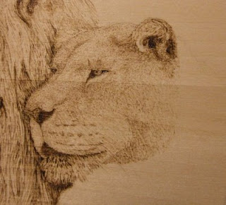
Woodburning a Lion's Face

lioness pyrography in progressI have worked on the lioness a little today and thought I'd share my progress. In this first step, I used the ball pen to add the short nose and forehead fur by stippling. With less heat, I went over it with a light touch to add some extra shading. For the cheeks, I used the extra small round skew with light heat and short strokes. I also darkened the male's mane to bring out the female's face.

lioness pyrography in progressIn this second phase I used the ball again to add structure to the rest of the face, using mostly stippling and tight squiggles and light heat. The shadow of the ear required medium heat to achieve the dark value, and I scribbled the ear fur in.

Here is where I stand at the moment. The short chest and shoulder fur was done with the small skew on light heat following the direction of the fur. I'm going to darken the mouth a little, and probably the male's mane a little more, then I'll continue in this way with the rest of the body.

Wednesday, October 15, 2008

Drawing with Fire

lion drawing pyrography in progressPyrography, from the Greek for "fire writing," is the the process of burning material (such as paper, leather and gourds) to make art. The only material I have tried so far is flat wood (one could also used carved wood, bowls, etc.). Special pens are used that come a large variety of shapes and sizes for achieving different strokes. For example, the skew is great for straight lines, the flat shader is best for shading, and the ball is perfect for writing and scribbling. The pens are hooked onto a generator that heats up the point. The amount of heat is adjustable to achieve different shades of burn.

Drawing with these pens is like a combination of ink and graphite. You can get a wide variety of shades like graphite (by adjusting the heat), and you can make it so you can't see the individual strokes (like blending). But like ink, it is indelible, unblendable, and unforgiving. If you make a mistake, you can scrape the char off with a knife, but that usually leaves a deep scratch on the surface.

I was given the reference photos for these lions by an artist friend of mine (the same who gave me references for the warthog and Mexican wolves) who got them from a photographer at the Cincinnati Zoo. White lions are very rare, and like white tigers they are not albino, just very lightly colored. I thought they would make a perfect subject for a woodburning.

In this photo the male lion is mostly finished. I still have his forearms to do, but there will be grass partially obscuring them and I want to save that for later. I am working on the female to give you an idea of the process. I start with the eyes, nose and mouth using the ball pen on a medium heat setting. By turning the heat down, I can get the lighter brown for the irises of the eyes. In the next couple days, I'll work on the rest of the face and post another update.

Friday, October 10, 2008

Announcing Limited Editions

Beginning today, I will start offering limited edition prints of my drawings, beginning with this turtle. Editions will be of only 25 and will be signed and numbered. You can purchase them directly from my website with PayPal. I chose this one because I think it is the best I have to offer that have not sold open prints yet. I hope to add more with future drawings.

Monday, October 06, 2008

On the Drawing Board

I've been pretty busy lately moving my website over to my own domain name (finally!) and updating all my links to it from all the art sites I belong to, not to mention some personal things that got in the way. I haven't had much time for drawing or blogging as a result, but all that is done for now. So, since I don't like to go so long without a post, I'll just explain what's in progress.

First of all, yes I'm still working on the colored pencil coral reef drawing. It has taken a back seat of late, but I plan on increasing the time I spend on it in the next few months. I figure I'm about a third done, and the next few species to add will be branch coral (probably white), the red lionfish, and then an anemone or two.

Next, I have laid out a very large pair of zebras. I'm really excited about this one, and I wish I had more than a sketch to post of it. I found a large piece of gray matboard hiding in the back of my closet, and I am going to use both black and white charcoal.

I like to have a small drawing going, too, so I can feel some accomplishment while the larger drawings take so long. This one is in sketch phase - I still haven't finalized the pose - but it will be a pair of sand cats. Sand cats are one of the smallest species of wildcats in the world and live in the deserts of the Middle East and northern Africa.

Then I have a still-life in pause right now. I was meditating on how I could improve my drawing and this still-life flashed before me. It took a few weeks to get all the materials and set it up, and I've sketched it on the paper I'll be using, but I haven't had the motivation to start. It could be that still-lifes (still-lives?) just don't interest me, or it could be that I don't know how to start, or it could be that I'm a little nervous about treading on unfamiliar territory. But it has been started, so I'm at least going to finish it.

And finally I'm working on a series of step-by-step drawings of various animal textures in pencil and charcoal that I will put into drawing tips and tutorials and, with any luck, a book. I've done a few eyes and feet so far, and I'll be sure to put lots of types of fur in, too. I figure all the drawings should take me close to a year to finish, and then a few months to add text. It will be great practice for me, too. And yes, there will be a page for the indenting method, I just haven't done that one yet.

So I apologize for not having any photos to post, but it seems that most of my work is in the early phase of completion. Next time, definitely.

Thursday, September 25, 2008

My Secret

gorilla charcoal drawingI completed the gorilla drawing yesterday, and to my pleasant surprise sold a print before I even got to post it here! I loved working on this drawing, so much that I forgot about my new multitasking routine and worked on nothing but him until he was done. As my first primate drawing, I am quite pleased with the result.
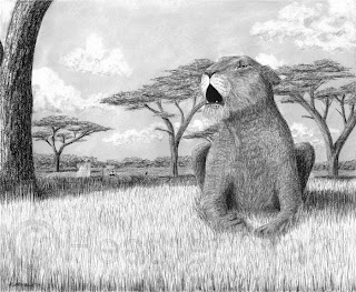
This gorilla is a resident of the Albuquerque Zoo (Rio Grande Zoo). He was sitting in the corner next to a plexiglass window, and the sun reflected off his enclosure giving him the appearance of being lit from a low angle. I'm not sure what is reflected in his eyes, but I liked the effect. That and his slight grin inspired me to call the piece My Secret, and it makes me wonder what he really was thinking.

The original and prints are available.

Thursday, September 18, 2008

WIP - Charcoal Gorilla

I haven't put up a work in progress in a while, other than my coral reef, so I thought I'd share what's on the drawing board right now. I've been wanting to draw a primate for a while now, and after an awesome trip to the zoo (and several hundred photos) last weekend, I got my wish. I got really close to a bunch of animals, one of which was this lowland gorilla just a few feet away from me. And I was lucky enough to get him in the perfect pose for a drawing.

I debated for some time as to which medium I would use, and even considered doing two copies, one charcoal and one graphite, just to see how they would differ. I still may, we'll see. As (almost) always, I started with the eyes. Then I worked on the skin of the face and down to the nose. I added the background (with a charcoal-covered chamois) before I put in the detail hairs hanging beyond the face boundary, then went to the eyebrows. The plan is to work up and around the head, down the neck, then do the hand last. I should add this image is only a portion of the full drawing.

I like working on unique animals and ones that I think are a challenge to draw well (like the warthog). It helps me improve and develop my technique. The best way to get better is to step outside your comfort zone and try something different.

Tuesday, September 16, 2008

Don't Hate Me 'Cause I'm Beautiful

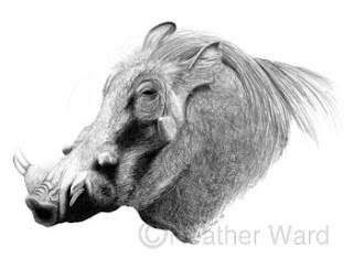
warthog graphite drawing
Oh, the misunderstood warthog, often deemed one of nature's ugliest animals. I actually enjoyed this piece, taking my pencil drawing to new territories. I used a wide variety of graphite pencils: 4H, 2H, H, HB, 3B, 4B, 6B, and 8B, along with a blending stump and an empty mechanical pencil. That's a trick I learned recently: while trying to find a suitable stylus to indent the paper to draw white hairs and fur, I came across another artist who said he uses empty pens - I went with what I have, which is mechanical pencils (thanks to my husband).

The indenting technique is not hard. Use the stylus to scratch the paper where the white fur or hairs will go, then use the pencil (or charcoal, or whatever) over it. The pencil will glide over the indentations and give the appearance of white hair/fur over dark hair/fur (or dark shadows).

Many thanks to Barbara Keith and her photographer Mike Dulaney of the Cincinnati Zoo for the reference photo. The original (14"x11") and prints are available.

Friday, September 12, 2008

Polar Bear Pointillism

polar bear ink pointillism drawingAfter seeing some really cool pointillism drawings, I thought I'd give it a try myself. Pointillism, also called stippling, is the creation of a drawing using only tiny dots. I decided my first attempt should be a white animal, as that would minimize the number of dots I'd need. I learned a few things about the technique.

First, it's not always possible to make an area darker just by adding more dots. You have to keep the dots fairly evenly spaced, so if you try to add more, the value may not be uniform and you could even end up with clusters of dots that look like lines or holes.

Second, it's best to know exactly what value you need for a given area before you start to stipple, so you can avoid the previously mentioned situation.

And third, give your eyes a break and don't do this for long periods at a time.

All in all, I like the technique and will probably use it again in the future. The original and prints are available.

Wednesday, September 10, 2008

Blog Award - Arte y Pico

Many thanks to Glendon Mellow of the Flying Trilobite, who has given me the Arte y Pico blog award! I am especially honored as he has a huge blog list. Here's how the award works:
  1. Pick 5 blogs that you consider deserve this award for creativity, design, interesting material, and contributions to the blogger community, regardless of language.
  2. Create a post showing your choices of award winners. Include the name of the winning blog and a link to that blog, to be visited by everyone.
  3. Each award winning blog, has to show the award and put the name and link back to the blog that has given her or him the award.
  4. Each Award winning blog and the one who has given the prize should show this link: “Arte y Pico“ showing the origin of this award. (The original blog originates from Uruguay. Here is a translation of the Arte y Pico blog.)
  5. Show these rules.

It was hard to get five picks, mostly because I don't usually read blogs other than the one that gave me the award! So I did some research, and here is my list of five of the best artist bloggers, in no particular order.

OnlyPencil. Lissandro Pena is a master of the pencil, creating incredible photorealistic animals, detailed tutorials and time-lapse demonstration videos.

A-Zoo. Lene Daugaard is another amazing realistic animal artist. She works in graphite and colored pencil with both domestic and wild animals.

WildlifeArt. Jason Morgan paints large scenes of wildlife in their natural habitats. Take a look at his works in progress, in particular the current one with zebras and wildebeests.

ArtDogBlog. Rebecca Collins is an animal artist specializing in dog portraits. Her paintings are vibrant and full of life, and she keeps her blog fresh with new posts almost daily.

ArtMentor. This is the only blog I picked not dedicated exclusively to drawing or painting, but also to the business of art. Wendy Froshay shares a plethora of tips for marketing and promoting your work after having been in the business for over 20 years, in addition to drawing and painting tips and book and product reviews.

Sunday, August 31, 2008

WIP Reef - Sea Fan

coral reef drawing in progress
Back to the coral reef for a while. The most recent parts are the beginning of a red lionfish (which I realized after I started is behind the coral) and a green sea fan. Sea fans belong to the order Gorgonacea, and like many of the corals I've been drawing the specific scientific name is difficult to pinpoint. Sea fans come in a variety of colors, usually orange, purple or yellow. The colonies organize themselves into a fan-like shape (hence the name) in a single plane to filter plankton out of the water as it flows through it. When the polyps are retracted, the coral looks more like a branch. Sea fans prefer to anchor in sand and can grow up to five feet long.

sea fan drawingDrawing this sea fan was simple, but required a steady hand. I used a base layer of peacock blue and a top layer of dark green for the skeletal structure, fading into aquamarine and olive in the lighter area. I used light aqua for the polyps and light cerulean blue for the hint of water you can see behind it.

I'm going to build up a little more of the hard coral below it, but I want to put in the block of branch coral first. I had started a lionfish because I figured I hadn't drawn a fish in a while, but since I'm working foreground-to-background, the rest of the fish will have to wait.

References: http://en.wikipedia.org/wiki/Sea_fan
http://www.samford.edu/schools/artsci/biology/bahamas/reefs.html

Thursday, August 21, 2008

Drawing Tip #16: Fur, Part III - Short and Long Fur

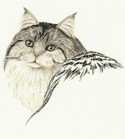
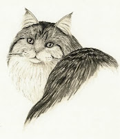
This is a long time coming, but I've finally done a demonstration just for this blog on how to draw fur. Long fur, in this case. I hope to do others for different kinds of fur. I am using Strathmore 300 series 70lb drawing paper. It has enough tooth to hold the graphite and charcoal, but not too much to be difficult to add detail. The subject is a Maine coon cat, noted for their size and long, flowing fur.

maine coon cat step 11- In the first step I have already drawn in the facial features. You can't see it, but I have also indented the paper with a stylus where the whiskers will go. My layout sketch is so light it doesn't show up, either.


maine coon cat step 22- I use a sharp 6B charcoal pencil for the fur, varying the pressure with the shade. I begin around the eyes. This is very short fur, so my strokes are also very short. I work the bridge of the nose with small, circular strokes with a very light touch. I blend with the same motion using a small blending stump. The left side is the blended charcoal, the right side is unblended. Note in particular that the characteristic M marking on the forehead is not made up of strokes following the M shape, but rather following the fur making up the pattern.


maine coon cat step 33- I continue to add fur with the 6B charcoal pencil and blending stump. The length of the strokes must match the length of the fur (proportionately, of course). As the fur goes away from the eyes, it gets longer. I fashioned my trusty kneaded eraser into a wedge and dragged it along the fur direction to add highlights, keeping the same stroke length. Finally, I went back over the area lightly with the 4B charcoal pencil to add random marks (random, but again along the fur direction) to add a little more texture to the fur. I also used the kneaded eraser to dab at the bridge of the nose to lighten it.


maine coon cat step 44- More of the same. Notice how the fur is getting longer as it goes away from the eyes and down the cheeks. For the white fur around the mouth and chin, I applied the charcoal directly with a blending stump. The best way I've found to do this is to grind up some charcoal using sandpaper, then dip the stump in and tap it to get rid of any excess. Use the kneaded eraser to pick up any stray specks.


maine coon cat step 55- I used the kneaded eraser (dragging in wedge form) to lighten the areas just below the eyes and to erase the smudges that got onto the whiskers (make a real fine point or wedge and it will fit right into the indentation). I also started the ears with the 4B charcoal pencil - small circles at the tips and leading edge, light long lines to create the negative space for the white ear fur.


maine coon cat step 66- Here I added more fur between the ears and at the back of the head to fill out the head shape. I also lightened the rest of the cheeks with the kneaded eraser. For the ears, I used the blending stump to smooth out the charcoal. Drag the stump from the outside in to create the ear fur and use the kneaded to touch it up.


maine coon cat step 77- The chest fur is all white, which is once again best applied with a dirtied stump. The Maine coon cat has long chest fur, so use long strokes.


maine coon cat step 88- Here I've finished the chest fur by adding more charcoal to the right side to create shadow.


maine coon cat step 99- Switching tactics a little, I used the 6B charcoal pencil to add the shadows of the fur on the back. The fur on the top is fore-shortened, so it looks shorter and we can see the fluffiness better - this means the shadows are closer together. Use strokes that flow down the back.


maine coon cat step 1010- In between the dark shadows, I used the same pencil with a lighter touch to add the rest of the fur. It's okay to leave white patches here and there, so long as they aren't too big. I went for my medium-sized stump to blend it all. The size isn't so much the trick as the condition it's in: it's worn down, almost frayed, so that it has a real soft touch. You could also get this effect with a chamois or felt or other soft blender, but the stump has the added benefit of being small and easy to manipulate.


maine coon cat step 1111- More highlights with the kneaded eraser. To the back fur, once again make a wedge and drag it along the fur to lighten an area. I thought the cat would stand out better with a darker background, so I applied charcoal dust with a chamois. I then used - you guessed it - the kneaded eraser to drag the white fur (chest and ears) into the dark background. (Don't mind the spots on the left, they are fingerprints and I'm working on photoshopping them out.)


I hope this has been a useful tutorial. I would love to hear from you as to how easy this was to understand, where I could improve, and any other comments. Ultimately, I would like to put together a bunch of tutorials like this into a book.

Wednesday, August 20, 2008

Multitasking

Up to now, when I started a drawing, I worked on just that piece until it was finished. I discovered, however, that by the time I near the end, I start to rush. Sometimes I am looking forward to the next drawing already, sometimes I'm just tired of working on the current one; either way, rushing makes a poor drawing even if it started out okay. As I mentioned in a previous post, the simple act of expecting the drawing to take a really long time did wonders for my patience and my artwork. I want to keep improving, so I figured I had to find a way not to rush it.

An artist I know (the same who proposed the Mexican Wolf challenge) told me she works on several pieces at a time, all in various stages of completion. She recommended having at least three, each in a different medium, for starters. So I have my coral reef, which is colored pencil, I always have a charcoal/graphite drawing in progress, and for my third I chose to go back to ink. Three drawings, all different media and different subjects, one almost done, one part-way, and one just beginning. And it has had a profound impact on my patience. Realizing and accepting that they are long-term projects, that they will not get done anytime soon, and that what's most important is that I am satisfied with the results has indeed pushed me to the next level I was hoping for.

Saturday, August 16, 2008

Moonrise Message

raven drawing in white charcoal
I like white charcoal. Back when I first started experimenting with it, I had several ideas come to mind, most with white tigers, but also a few night scenes. This was one of them. The challenge in this drawing was not the animal as in most of my work, but rather the moon. I tried to get it as close as possible to the real thing without getting overly detailed. This paper has a patterned tooth that I find difficult to do detail work with.

The bird in the image is a raven. Ravens are very common in North America, and many native traditions believe the raven is the messenger of the spirit world. This raven is calling out a message for those who would listen. I liked the idea of the black bird silhouetted against the bright, full moon.

Prints and the original are available.

Wednesday, August 13, 2008

The Blackest Black

Since I don't have any new art to unveil, I thought I'd share an article I read a couple months ago. My Alma Mater is co-creator of the world's blackest material. Made of carbon nanotubes, the material reflects 30 times less light than the previous blackest material; the degree of blackness is determined by how much light is reflected and how much is absorbed. Carbon nanotubes are microscopic tubes built out of carbon atoms. Future research could lead to material that absorbs all light directed at it, or an "invisibility cloak" that bends light around the object behind it. Read the full story here.

Wednesday, August 06, 2008

Gentle Giant

African elephant graphite pencil drawingThis is my first strictly graphite drawing in a while. I thought the skin texture of the elephant needed something a little grayer. It was a little different for me, drawing an animal without fur or feathers, but I like how this came out much better than the rhino from a few months ago.

Drawing wrinkles is tricky. You can't get them too dark, or they look too deep. You can't just draw a line, either. Depending on the orientation of the wrinkle with respect to the light source, there is usually a dark side going into it, then a light side coming out where the light hits. You have to get both just right (and consistent) for it to look real.

I used mostly the HB, 4B and 9B pencils with the tortillon for blending. I also used the indent technique for the eyelashes, to make sure they stood out lighter than the background.

The original is for sale and prints are available.

Saturday, August 02, 2008

Drawing Tip #15: Keeping Pencils Sharp

Keeping your pencils sharp is key to doing detail work. That can be easier said than done - some pencils (like charcoal) wear down so fast you'll wonder if it's worth it to sharpen at all. Here are a few tips for keeping those pencils pointy:

Graphite pencils:
Usually the electric pencil sharpener is sufficient for these, even the softer leads. But if that 9B is stubborn, try a manual sharpener or a knife (always slice away from your body).

Colored pencils:
I'm sure an electric sharpener would be fine for colored pencils, but I prefer to use the tiny hand sharpener that came with the set. If your pencils have a penchant for breaking (and apparently Prismacolors do), it's better to use a hand sharpener so you can better control the torque you put on the shafts.

Charcoal pencils:
I found out quite early that I cannot use an electric sharpener with charcoal, especially the 6B. I can use a hand sharpener, but it still doesn't get it nice and pointy. The only way I've found that works is to use sandpaper. Sharpen by hand as far as it will go, then drag it backward along fine sandpaper, rotating and dragging again, until it is the desired sharpness. The knife would also work, but charcoal chips easily so just shave very lightly.

Carbon pencils:
My hand sharpener works pretty well with the carbon pencils. If I just can't get that extra pointiness I need, I'll use a knife or sandpaper to hone it.

The added benefit of using sandpaper with charcoal or carbon is that you end up with a pile of charcoal or carbon dust, which is great for picking up with a stump, blending cloth or tissue to apply directly to the drawing.

Gallery Exhibition

Last night was the opening reception for a local exhibit I was accepted to. The title is "Members' Best" and is a juried exhibit of the best work of members of the gallery. There was a large variety of media, subjects and styles, and I was the sole representative of charcoal. I had a lot of good response for my turtle, including one guy who asked me if I was a photographer. Here's the official exhibit site. (This link will likely only last through the end of the show on September 6.)

Thursday, July 31, 2008

One Thousand

Wow, in just about six months I have accumulated 1,000 hits on this blog! I reached the magic number last night. I have had visitors from all 50 states and over 50 countries (including one I hadn't even heard of). Many thanks to those who have stopped by.

Saturday, July 26, 2008

Mexican Wolf Challenge

An artist I know through Fine Art America offered this challenge: she posted two photos of wolves and asked anyone who was willing to put them both in a single piece in any medium. Of course, I took the challenge (actually, she calls it an experiment) and took the opportunity to experiment a little myself. I used a combination of carbon pencil and colored pencil, and I have to say I love it. I can get nice blacks quickly and easily while still getting vibrant colors. There are three types of gray colored pencils: warm (reddish), cool (blueish), and french (brownish). In my opinion, none of them are truly gray. Now I have true gray on my palette!

But it is also interesting how the carbon and wax colored pencils interact. You can put colored pencil on top of carbon pencil, but because of the waxy nature of the colored pencil, you can't do the reverse, especially on a thick layer of color. So I could put a layer of carbon, blend it to the desired value, then cover it with the colored pencil. Using the blending pencil on top of that blends it all together and lets the carbon show through a little. One nice thing, though, is if you blend the carbon over a colored area, you can use the kneaded eraser to lift it off very easily. Or you can leave it there to dull the colors. They also work very well next to each other, like in the fur.

If I had to do it over again, I'd change some things and spend a little more time on it. But since I was experimenting I don't really consider this a finished piece.

Wednesday, July 16, 2008

WIP Reef - Hard Coral

coral reef drawing in progressAfter some time away for other projects, I'm back onto the reef. Completing this corner really got me excited because it's starting to come together. It looks like nearly a third of the drawing is done.

hard coral drawingThis coral got the best of me. I found at least four photos linking it to the Great Barrier Reef or the Indo-Pacific area, but no where could I find out what it is called. But I wanted it in my drawing, so I put it there. It appears to be a pink soft coral with yellow polyps that grows in clusters like grapes. I used peach and blush pink for the highlight areas, carmine red and poppy red for the midtones, and poppy and tuscan reds for the shadows. I went over it all with the blender. The yellow polyps are spanish orange and yellowed orange.

The surrounding area is a mixture of hard corals creating the support structure for the outcropping. Hard corals are the "reef-builders" that the soft corals attach to. I wanted this area to be dark so the bright damselfish and bannerfish would stand out. I used a lot of black and tuscan red, and also three shades of warm grey, poppy red, mulberry, slate grey, white, blush pink and olive. I blended with the blender (I do that a lot, don't I?).

Now, which part comes next...?

Monday, July 14, 2008

Book Review: Creating Textures in Colored Pencil, Gary Greene

Creating Textures in Colored Pencil bookWhile I'm working on the next part of my coral reef, I thought I'd post another book review. This is the only colored pencil book I own. I learned almost everything I know about colored pencils from this book.

Greene begins by giving the usual introduction of materials and tools. He describes different types and brands of colored pencils and erasers, and what kind of paper gives what kinds of effects. This is all great information if you're new to this medium.

Then he goes into the three basic techniques: layering, burnishing and underpainting. He does an excellent job of using the same drawing (an apple) for all these examples, so you can clearly see the differences.

And then the meat of the book. Example after example of how to apply these techniques to achieve texture. There are several flowers, fruits and vegetables, leaves, trees, water, animals, people, and man-made materials. Each one he takes you step-by-step: which colors he used in what order; how hard to press with the pencil; whether he used solvents. And there's an image (or part of an image) showing each step. After a while, I started getting the hang of it and could almost predict what he did in each step.

The pictures in this book are incredible - you probably wouldn't have guessed they were colored pencil if you didn't already know. Greene is an amazing artist and he does a great job of explaining how to use the colored pencils.

Tuesday, July 08, 2008

Website Redesign

I haven't been doing a lot of drawing the past week because I've been redesigning my website. It's finally done! Take a look.

Thursday, July 03, 2008

Saw Whet Owl

saw-whet owlI experienced an incredible confluence of events two weeks ago. In my town, there is a farmer's Market every Thursday. In my five plus years here, I had only been to it once. Then my daughter's playgroup decided to meet there (there is a playground right next to it). Things were going against us, though. We were supposed to meet at 10, when my daughter usually has her snack. I tried for an early snack, but then my husband forgot something and I had to bring it to him at work. So we showed up to this playgroup 45 minutes late, and I didn't see anyone I knew (lots of other people, though). I let her play for a while, then decided I should probably take a look around while I'm here. It was getting late, so a lot of vendors were low in stock or closing up. And then, I almost missed it. One tiny table under the trees, covered in pamphlets and a donation jar. A woman sat behind the table and at first I didn't even notice the tiny bird in her hand. It was an owl, not more than 5 inches long. I took their newsletter and read it. The Santa Fe Raptor Center rescues raptors and other wild birds that have been injured, rehabilitates them, and releases them back into the wild whenever possible. I offered my services as an artist.

saw-whet owl in colorInspired by their story about rescuing four saw whet owls (which I had not heard of) recently, I drew one sitting in an aspen tree. So while I wait to hear if they are willing to work with me, I will offer prints of this drawing and donate a portion of the sales to the Center.

A little about the drawing itself, the original is 11"x14" paper with mostly charcoal and a little carbon pencil. I wanted to try out the carbons, and I really like them. They are similar to charcoal, but much, much smoother. They blend nicely like charcoal, but are impossible to erase. I was a bit reluctant to use too much carbon on my first try, so it's mostly in the darker feathers just giving some extra detail. I'd like to use them more in the future. Then I decided to try something else new. I added a touch of colored pencil on top of the charcoal and carbon. I love this effect, just a little color, with all the detail still showing through.

Monday, June 30, 2008

Hear Me Roar

lioness roaringI took some time out of my coral reef to do some charcoal. I had been thinking of this one for some time, and had planned on doing a fur drawing tutorial from it. However, I really don't like how the lioness came out, so I'll have to wait for something else for a tutorial.

This drawing is 17"x14" charcoal on vellum paper. The idea came from the phrase and song title "I Am Woman, Hear Me Roar," hence the female lion roaring. The layout changed dramatically from its conception, from the lioness in complete profile, with a half-background, with just a shadow underneath, etc. I just kept adding features and moving the lion. I'm glad I added the background trees. They are acacia trees from the Serengeti, where lions are prevalent, and drawing them was quite easy. Just a 4B charcoal pencil in sweeping motions for the trunks/branches and in scribbles for the leaves. The distant trees are just scribbles, with 2B vertical strokes here and there to indicate trunks.

The grass is 2B in a random vertical fashion (tip here: blades of grass are not parallel. Keep some randomness in them to make them look real). The sky is a very light layer of 6B in a small circular motion, blended with a chamois that I tried for the first time (love it, by the way). I added the clouds with a kneaded eraser, kind of rolling my wrist around to get a general cloud shape. I added the shadows with charcoal applied with an unsharpened stump.

I am offering prints for a limited time.

Tuesday, June 24, 2008

Drawing Tip #14: In the Right Light

To make a realistic drawing or painting, you have to use the right lighting. Unless you are using several lamps, light basically comes from one direction. I'll put in another plug for the book Drawing Realistic Textures in Pencil. Hillberry has a very nice section on light.

sea turtle drawingFirst thing, you have to be consistent. If it helps, mark on your sketch or references exactly where the light is coming from. In this turtle drawing, the light is coming from just left of straight up.

Next, look at what would be hit by the light strongest - where is the light pointing to directly? These will be the lightest value areas. Also, what is being blocked from the light? These will be your darkest values.

Color affects the value even in black and white. The shadow side of a bright yellow banana, for example, might still be a lighter value than the light side of a dark avocado. In the turtle, the dark shell in full sun is darker than the shadow of her jaw. Texture does this as well. All other things being equal, a shiny surface looks brighter than a rough surface, especially in the highlighted areas. This is because the rough surface diffracts (scatters) the light more, while the shiny surface reflects more.

You have to pay attention to reflected light. This occurs when light reflects from one surface onto another. An area that you might think would be a very dark value might be lighter if there is another surface nearby. Shadows also may be lighter than you think. Because of reflected light, shadows are darkest near the object, then get lighter farther away (but not too light). Take a look at the shadows of the turtle on the sand, especially near the head. You can also see the reflection of the light parts in the wet sand beneath her. This is an example of reflected light.

The best way to learn how to draw light and shadow is to observe it. Look at real objects, look at photos. Try to judge what values are darker than others. Notice what happens under different lighting: direct light, diffuse light, complete shadow, or multiple light sources.

Thursday, June 19, 2008

WIP Reef - Purple Soft Coral

coral reef drawing in progress
This purple coral is the same genus as the red and white one, Dendronephthya. I forgot to mention, thanks to Poppe Images for helping me classify them. As far as I can tell, the purple is pretty much the same as the red, but the polyps are bigger, or maybe just cover more of the support matrix. I found them in the same photo as the red coral.

purple soft coral drawingThe color was pretty easy to figure out. I used lilac burnished with white for the white support matrix and various shades of purple layered with mulberry for the polyps. The purples used were violet in shadow, lilac in highlight, and parma violet in between. I used the burnish pencil for the polyps, too. The dark area behind it is warm grey 90%.

As with the leather coral, I drew in the highlights first, then the midtones, then the shadow, but this time with a circular motion. I then covered with mullberry, and the stalk came last.

References:
http://www.poppe-images.com/

Sunday, June 15, 2008

WIP Reef - Leather Coral and Sea Stars


This photo is roughly the bottom left sextant of the whole piece. It took me about seven hours and consists of three species.

Leather coral (genus Sarcophyton) is another soft coral. It feeds on plankton and consists of hundreds of tiny polyps, which are individual animals. When the polyps are contracted, the coral looks leathery (hence its name), and when they are extended, as in this drawing, it looks fuzzy. They can get up to three feet across. There are two colonies here, the one in the foreground is called a "mushroom" leather coral beacuse, well, that's what it looks like.

This coral was kind of difficult. I chose several colors for the overall structure, planning to draw the shadows around the polyps. This took a lot of scribbling, essentially. It went fairly quickly considering how much area I covered. I used three shades of french grey - 10%, 50% and 90% ('cause that's what I have).

The dark shadow in the corner is a few layers of black and french grey 90%, blended.

Sea stars, or starfish, come in many colors. I have included two here, blue and red. Sea stars grow no larger than a foot across and eat mostly algae and microbes. The mouth is at the center of the animal, and it pushes its stomach out on top of the food to digest it before bringing the stomach back into its body. Usually found with five regenerative-capable arms, they have an eye at the end of each one.

The blue sea stars (Linckia laevigata) are only four colors - a base color of indigo and ultramarine, shadows of black and indigo, and spots of peacock blue and ultramarine - blended with the blender (except the spots).

The red star (Fromia milleporella) is crimson red, with black fading into tuscan red for the shadows (all blended, again). The spots are black.

References:
http://www.sheddaquarium.org/SEA/fact_sheets.cfm?id=103
http://www.getinvolved.qld.gov.au/emblem/ss_star.html

Thursday, June 12, 2008

WIP Reef - Red Soft Coral

I had a heckuva time trying to figure out what this coral was called. It was in one of my general reference photos, and I thought it was so unique I had to include it in my drawing. Well, I needed more than the one tiny photo, so I had to figure out what it was. After pouring through dozens of photos in several databases, I discovered it is a red soft coral, genus Dendronephthya. There are so many species in this genus nobody would list them all (that I could find).

Like hard corals, soft coral is an animal, not a plant. But unlike hard coral, they consist of a group of polyps (the red parts of this one, which are individual invertibrates) and the sclerite, or crystallized calcite, at their base that holds them together. The white part is a flexible "inorganic matrix" of material to support them. Hard corals also have polyps, but they and their structural support are, well, hard. Soft coral primarily feed on algae and plankton.

This coral was actually pretty simple to draw. Once I had the shape, I added the red polyps with crimson red, and where they were in shadow I used tuscan red layered with crimson. They are just tiny dots, really. The white stalk is, of course, not white. Shadow is achieved with slate grey burnished with white. It results in a very slight blue hue.

References:
http://www.peteducation.com/article.cfm?cls=16&cat=1927&articleid=2987

Wednesday, June 11, 2008

WIP Reef - Longfin Bannerfish

The longfin bannerfish, Heniochus acuminatus, are omnivorous saltwater fish that feed mostly on plankton and invertibrates. They can grow to 10 inches long, but I guess these two are still young since they're the same size as the damselfish. They are very similar to the moorish idol (Gil from Finding Nemo), differing visually by an extra stripe on the tail and more yellow on the sides of the idol.

The black stripes on these guys are actually black, with a touch of white on the forehead area for a highlight. The yellow fins are olive green topped with deco yellow and yellow ochre. The cheeks are lilac with metallic silver and white and the rest of the white areas are metallic silver. The eye is black with a small metallic gold ring around it. The long dorsal fin will remain untouched paper, which is why you can't see them very well. They took just over an hour.

References:
http://en.wikipedia.org/wiki/Longfin_Bannerfish

Tuesday, June 10, 2008

WIP Reef - Yellow Damselfish

The damselfish is a class of marine fish commonly found in coral reefs. At about 3.5 inches long, they feed primarily on algae and planktonic crustaceans. There are several species and colors, such as cocoa, four-stripe, white spotted, blue, and this yellow. They are popular in tropical aquariums.

These little yellow fish (Pomacentrus moluccensis) are so brightly colored I wanted to put them in a dark area of coral so they stand out (the coral will come in much later). I played around with colors for a while, and eventually came up with the following set. First I added shadow with olive green. Then I went over that and added midtones with yellow ochre. To the midtones I added deco yellow and also used deco yellow for highlights. I blended with the blender and burnished everything with cream. The white underbelly consists of various shades of warm grey and the eye is black. I then added a hint of scales with warm grey 90% all over. All three little guys took me about two hours.

References:
http://en.wikipedia.org/wiki/Damselfish