Thursday, December 31, 2009

Drawing Tip #23: Applying Charcoal with Tools

The most common way to draw with charcoal is by simply placing it on the paper and moving it around. You can get nice, dark marks or even thin, light ones this way. But there are times when you simply cannot put so little pressure as to get it light enough, especially if you are looking for a smooth, even texture like sky or skin. This is where you need tools to apply the charcoal for you. (You can also use the tools to get a dark value, depending on the amount of charcoal you use.)

I have divided the tools I use for applying charcoal into three categories: blending stumps and tortillons, tissue and chamois, and paintbrushes and cotton swabs. Click on the image to view it larger. I went a little dark on these samples, mostly to show the texture you can get. Just use less charcoal and a lighter touch and you can get almost imperceptibly light areas.

I have found the best way to apply charcoal is to start with charcoal powder. You can buy it by the jar, but it is easy to make your own by grinding a stick (don't waste the expensive pencils on this) or vine with fine sandpaper and collecting the powder in a vessel.
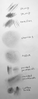
charcoal applied with toolsStump/Tortillon: With stumps and tortillons, you can also use the stick or pencil charcoal to draw on the tool to greater control how much charcoal gets used. Use the side of the blenders in a circle to get a smooth texture, or drag it along to get streaks or other textures. Use the point to get into small areas.

Tissue/Chamois: I don't use the tissue much, but if you don't have a chamois, it's the next best thing - it just has a slightly rougher result. Using the chamois with charcoal powder on it (not much, mind you, a little goes a long way) is how I do sky. Often, I need a very light but uniform base, and no amount of blending charcoal applied directly will do it, even on extra-smooth paper. You will get a bit of charcoal pieces, especially if you used rough sandpaper, but just move the chamois around in circles and it will even out. These tools are best used on large areas.

Paintbrush/Cotton Swab: The cotton swab is a new tool for me, so I haven't had much opportunity to use it, but in playing with it, it seems easy to get small areas of very light to very dark smooth texture. I have two paintbrushes: one with a soft round tip and one with a slightly firmer angled tip. The rounded paintbrush is great for adding small areas, and it is fairly easy to grade from light to dark. I use this brush for adding value to skin. The angled or pointed brush is great for getting into tight spaces or drawing flowing hair or distant tree trunks. The most important thing to remember with paintbrushes is to tap off the excess powder before you touch the drawing. I will often tap it on a paper towel or tissue to make sure the charcoal bits don't get on the drawing and produce streaks. Another way to keep this from happening is to use the dust from the powder. Close the container tightly and gently shake it to make the powder cover the sides (and top if you wish). You can then use the brush to take charcoal dust off the sides or top with little risk of getting large charcoal bits.

Take some time and some spare paper to experiment with using different tools to apply charcoal powder. You will increase the range of values you can achieve while keeping the texture interesting.

Thursday, December 24, 2009

Book Review: Pyrography Workbook, Sue Walters

pyrography workbookI don't do a lot of pyrography, but I like it because it is very similar to drawing. There are some big differences, though, starting with the fact that you cannot erase. I don't remember how I discovered woodburning, I just remember that I fell in love with it the first time I tried while going through this book.

The author, Sue Walters, is an internationally-known Australian pyrographic artist whose focus happens to be on animals. I have found that fur lends itself to woodburning rather well. The book starts out with a comprehensive overview of the equipment needed and the different types of burners available. While she prefers one kind, she is careful not to push her choice on the reader. There is a quick chapter on transferring your design to the surface, and another on the different surfaces you can use in addition to wood. Then, of course, a good description of how to take care of your tools.

Chapters five through seven show the wide variety of burner tip shapes you can use, with several examples of each and a description of how to hold the pens properly. There follows three projects of increasing complexity with step-by-step lessons, with explanations on how to do different animal textures. She ends with chapters on adding color, troubleshooting, and practice patterns.

My only problem with this book is that it focuses only on animals. This was fine for me, but I'm sure many people would want to do other subjects as well. Once you practice the techniques in this book, it is not that far a stretch to do people or landscapes, for example, but you may have to do some experimentation on your own.

This is the only pyrography book I own. It does take practice, but is well worth the effort. I highly recommend this book for anyone interested in learning pyrography.

Sunday, December 20, 2009

New Exhibit in Minnesota

gorilla framed charcoal drawingGosh, I've been a little busy the past month it seems! I am still around, mostly getting Christmas stuff tied up, but I do want to share a piece of good news I got yesterday. My Secret has been accepted to the 2010 Arts in Harmony national exhibit at the Government Center in Elk River, Minnesota, from Feb. 8 through March 25. Stop by if you are in the area!

Thursday, November 19, 2009

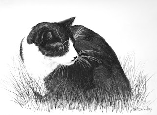
Cat in the Grass

tuxedo cat portrait drawing in charcoalLast year, I drew one of my cats, Quark. I figured it was high time I drew the other one! (Of course, I now have two additional cats, but I will get to them in due time.) So here is my buddy Lepton, the only male of the four. We let the adults outside in the yard supervised occasionally. Here, Lepton was probably watching a grasshopper. Like the drawing of Quark, this was a relatively quick one. And, like Quark, prints are available, but I'm keeping the original!

I do take commissions for pet portraits. If you are interested in one before the holidays, please contact me no later than November 30.

Saturday, November 14, 2009

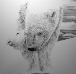
Bear Kiss


Here they are, mother and baby. Since the last post, I finished the fur, added detail to the mountains, and darkened the water. I am so excited with how this drawing came out that I am going to do a series of mother/baby drawings.

Prints and the original are available.

Wednesday, November 11, 2009

WIP - Polar Bears Update

polar bear drawing in progressI am getting more excited about this piece the more I work on it. The polar bears are really starting to pop! And the baby, which I have no direct photo reference for, is coming along rather well, I think. I am working in two layers for the faces: charcoal applied with the stump for the shadows; and the 2B pencil for detail work. I plan to fade out the pencil so the bodies will be done only with the stump.

Tuesday, November 10, 2009

Charcoal Class a Success

Saturday I taught my first art class, an introduction to the tools and techniques of charcoal. I passed out all the tools I use routinely and the different papers I have tried. I did several demos and we spent the rest of the day experimenting and practicing drawing from several black and white photos I brought of various subjects. The class was well received, and I plan to teach another class in February on animal textures.

Sunday, November 01, 2009

2010 Calendars

I now have two calendars available on RedBubble. The first is the same as last year's, just updated to 2010 and with a new title, and the second is a collection of work from this year. Take a look!

Saturday, October 31, 2009

Pumpkin Time!

Time for carving fun! I tried a new technique with my pumpkin this year that allowed me to use essentially three values. The mid-tone is achieved by carving away only the top layer of the rind. This allows some light to pass through the flesh of the pumpkin. It is a bit like working on scratchboard, in that you start with the dark background and carve away to get lighter areas. I found I couldn't use just any kitchen knife for this, so I actually got out my miniature wood carving gouges! They were just the right size and worked perfectly.

Happy Halloween!

Thursday, October 29, 2009

WIP - Polar Bears

If there's one thing I've learned about drawing white fur, it's that it is much easier to draw the background first, then erase where the fur goes (especially in the sky). This is how I am approaching this drawing. There is a second reason, and that is I like to do the part of the drawing I'm the least confident in first. I know I can draw the bears. I've never drawn snow-capped mountains or ice floes before. So if I do them first, and something goes wrong, there's less time wasted in starting over (and there's nothing wrong with starting over, because that means you've learned something).

So here she stands, nothing more than a nose and eye in a silhouette in front of blocked-in mountains and icy water. Her baby will be in the foreground, not visible at this time. I am excited about this one!

Sunday, October 25, 2009

Polar Bears: Setting Up a Composition

I took about a week off to visit my family, but now I'm back and ready to start drawing. I don't have much to show yet, but I want to share a little about how I put together a composition. In this case, my idea came from this photo I took at the zoo recently. The polar bears were out waiting for breakfast and I got several good shots of them pacing, but I chose this one (it has been cropped and converted to grayscale).

To make it more interesting, I decided to put a cub at her feet and I will change the background to a more natural arctic landscape with ice and mountains. I initially wanted to put the bears to the right side, hoping to balance their weight with the distant mountains. But the more I looked at my sketch, the more it didn't look right. So I will put the bears to the left side, because their weight will be balanced by the mountains and the fact that they are facing to the right. (Thanks so much to the book Design and Composition for explaining how to identify this.)

This drawing will be 17"x14" on Strathmore smooth bristol 2-ply paper (as usual!). In the next few weeks, I'll post my progress.

Saturday, October 10, 2009

Tranquility

geese charcoal painting
Okay, here is my first drawing using wet charcoal as described in a previous post. I don't know anything about watercolor, so I asked around. Watermedia do best on rough-textured cold-press paper. But I just can't give up my hot-press smooth bristol. I taped the paper to my easel all the way around to keep it from warping. I drew the geese with my usual pencils, blending stump, and paintbrush (for the very light shadows), then went in with a small round-tip paintbrush with charcoal-water mixture. Not knowing what proportions to mix, I started too light and ended up doing a few layers to make the pond darker.

By contrast, below is the drawing using only dry charcoal. I layered, erased highlights (with both a kneaded eraser and a cordless electric eraser), added lowlights, layered some more. I still didn't get the look I was after.
geese charcoal drawing

I am quite happy with this first "charcoal painting," and plan on exploring this technique more. I have the original and prints available.

Tuesday, October 06, 2009

Wildlife Art You May Enjoy

elkI recently received an email from the folks at Horse and Wildlife Gifts complimenting me on this blog. They invited me to check out their website, and I love the selection of unique high-quality items. Honestly, I could browse their sculptures and home accents for hours. Here are just a few of the things that caught my eye. Be sure to visit their store website (you never know what you'll find!) and their new blog.


deer and mountainshorses

Sunday, September 20, 2009

Drawing Tip #22: Painting with Charcoal

Given my love of experimentation with charcoal, I'm surprised I never tried this earlier. Perhaps I was afraid, as I love charcoal precisely because it is a dry medium. But it is a wonderfully water-soluble material, and though I routinely paint with charcoal dust, I have never painted with charcoal dust and water. Until now! I don't have any finished drawings (or even in-progress drawings) to show using this technique, but I am so excited by it that even though I really should be going to bed I am instead writing this post.

The method is simple. Grid up some soft charcoal with sandpaper or purchase a bottle of charcoal powder, and find a decent paintbrush. The one I chose was a $2 soft round-tip brush, the one I use for painting with dry powder. I'm sure any brush for watercolor would be fine.

For this test, I just poured a small pile of powder onto my paper, which happened to be a scrap of smooth bristol paper. Then I wet the brush and swirled it around and started playing. The results are wonderful. The paper doesn't hold up well, though, which I expected. Typically water media do better with rougher paper. You can get a wide range of values from very light to pretty dark. I can foresee uses for underpainting as well as just plain painting in black and white. The best way to implement this is not to mix your charcoal right on the paper, of course, but to have perhaps another paper or a plastic palette to mix first, test the value, then apply to the drawing. Try it out! And apparently it works for graphite, too.

Thursday, September 17, 2009

Dive

I tend to draw primarily mammals, but falcons have a special meaning to me. One of the falcon species native to my area is the peregrine, famous for being the fastest animal on earth, with speeds topping 300mph in their headfirst dives. I wanted to capture this in a drawing.

After being nearly wiped out by DDT in the '70s, the peregrine has made a full comeback in population. I recently had the opportunity to attend a seminar on raptor identification, focusing on the species here in New Mexico. Falcons have two key features: first, the area around the eye is completely devoid of feathers and matches the cere (area around the nose) in color. Second, they all have a malar stripe, a dark patch of feathers that goes straight down from the center of the eye, though the stripe is sometimes hard to identify in individuals with a full dark cheek.

Falcons' greatest strength is also their greatest weakness. The raptor can dive fast from great heights and knock flying birds out of the sky, catch them, and fly off to eat. Because of their speed and concentration on their next meal, they cannot see the power lines in their way. An impact with a power line can sever a wing, or cause severe tissue damage or electrocution. A portion of sales of prints and the original will go to The Wildlife Center which
rescues and rehabilitates these beautiful birds.

Friday, September 11, 2009

New Exhibit in Texas

I wanted to share the great news I got late last night, that my penguins have been accepted to the 8th Annual Wildlife Juried Art Competition, put on by the Irving Arts Association of Irving Texas. The exhibit will run from October 4 through October 29, 2009, at the Jaycee Center for the Arts. This will be my first non-local exhibit, and I am rather excited! If you are in the area, check it out!

Also, this morning I found out that my zebras have been chosen as Pick of the Day at 1stAngel, an art website based in the UK.

Wednesday, September 09, 2009

Book Review: Design and Composition, Nathan Goldstein

Design and Composition book by Nathan GoldsteinAs I've mentioned before, I am a self-taught artist. I search out books to be my teachers, and so far they have taught me many lessons in techniques in different media. This I have been practicing for nearly two years. I decided it's time I learned a thing or two about composition. I knew the basics, such as the rule of thirds, but I wanted something more. After much searching on Amazon, I selected this book, Design and Composition by Nathan Goldstein. My version is strictly black and white, simply a photocopy print of the original color version. Even though it is just a black and white copy, it comes with a hefty price tag.

The book is structured in two parts. The first discusses several basic elements of drawing and painting, namely line, shape, value, volume, space, texture, and color. I found it difficult to get into the book, as the writing can be dry, especially in the first couple chapters. But once I got to the chapter on value, I couldn't put it down. He discusses the importance of balance, and uses case studies of famous paintings and drawings to show the effects of each of the elements.

The last two chapters are the best part, in my opinion. He describes 15 different layouts found in virutally all paintings (most have more than one of these layouts), including the effect of each (like the stable grid or the peaceful horizontal format or the high-energy radial burst) and things to look out for when using them (like not separating out the leftover rectangle in the L-shape layout). Then he describes 15 different modes of presentation, such as shallow or deep space, density of subjects, and emphasis on value, color or texture. Finally, he takes several paintings and takes them apart to see what makes their compositions work.

The one thing I disliked about the book was the photos. In general, most of the images were poorly reproduced, grainy or blocky. The black and white colorplates often contained a grid pattern that severely distracted from the content. I figured I didn't need the color as I work in black and white, but I do feel I missed something without the color.

I learned a tremendous amount from this book, but the author was careful not to allow his observations to become hard and fast "rules" of composition - they are merely guidelines. It is the artist, after all, that must add the feeling and passion into a painting, and that cannot be taught.

Wednesday, September 02, 2009

Cold Wind

Alaskan tundra wolf charcoal drawing
This drawing is really more like a painting. With the exceptions of the eyes, nose and mouth, I used charcoal powder with a paintbrush or the chamois to keep the texture light and airy. (Hey, there's a future drawing tip idea!) The wolf depicted is the Alaskan tundra wolf, a subspecies of the gray wolf. 18"x24".

Prints are available!

Tuesday, September 01, 2009

A Matter of Scale

On a recent recommendation from another art blogger, I've decided to post new photos of my framed work to help convey the scale. Here are four hung over my couch (others on my regular website). Actually, the zebras aren't framed yet but that's what I envision it will look like.


Monday, August 31, 2009

Grazing

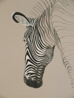
Grevy's zebras charcoal drawing
Here they are! Gosh, I worked on this one for two months exclusively, but it's finally finished. I have no experience painting to speak of, but it sure felt more like painting than drawing. I hope to include this in my exhibit next summer (June 18 - July 24, 2010!), and I'm considering doing a series of these large-size (30"x30") drawings with other African mammals.

Prints and the original are available.

Friday, August 21, 2009

WIP - Zebras Coming Along


The second zebra is on its way to completion. In this photo, the neck was blocked in but the shadows had not been added yet. Just a few more legs to go! And then I will need to figure out the background.

Thursday, August 20, 2009

Inside The Studio

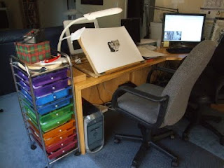
my art spaceIf you can call my corner of the desk a "studio" at all, then here is the official tour! (Thanks to Glendon Mellow for the idea for this post.) Because I work with pencils, I need very little space to store my supplies. A simple pencil box holds all my graphite, charcoal, Conte, pens, three erasers, three kinds and several sizes of blenders, styli (styluses?), sandpaper, and a folding knife. I use a tabletop easel to save floor space, one that has a nice adjustable incline. It currently covers my 9-year-old Mac, which will soon be retired. I use the large monitor in the corner to display my reference photos while I draw. Then I have the colorful set of drawers to hold other random art supplies. I keep my paper in a nearby cabinet and finished unframed drawings in acid-free boxes under my bed. While my small space is next to a south-facing window, I also have a daylight lamp for when I draw after dark. It's a simple setup, but it works.

Thursday, August 13, 2009

Drawing Tip #21: Preventing Smudging

Pencil work can be extremely messy, no matter what type of pencil you use. Even colored pencil will smudge or get on your fingers if you lean on it. I wrote a short post last year about how easy it is to get fingerprints on your charcoal drawings. While searching for a good topic for a new drawing tip, I realized I have let this topic go too long.

The key to not ruining a drawing by smudging is, of course, prevention. There are many steps you can take from start to finish to ensure you keep your fingers off your paper. As I mentioned in the fingerprint post, just handling your paper before you even start can lead to fingerprints on the finished drawing. When I tear the paper out of the pad, I wear disposable cotton gloves. I also wear them while laying out the sketch, because I tend to touch the paper a lot. Once the paper is on the easel, I leave it there until it is finished. The less I move it around, the less chance there is to touch it accidentally. Once it is on the easel, I also do not tape it down since even artist's tape will leave gum residue that sometimes cannot be camouflaged.

So you're finally sitting down to a nice, white sheet of paper. What happens when you start to draw? If you're right-handed, you could draw left to right, top to bottom, to avoid touching areas you've drawn already. This is usually not feasible, however (I mean, who does that, anyway?). The key is to put something over the parts you've drawn so you don't stick your hand in it when you draw on the other side. To avoid touching the paper altogether, I do this even with the blank paper. So what do you use? Find a piece of paper, preferably acid-free but newsprint or tracing paper will do, that is larger than the drawing paper, and lay it over. I don't tape mine down, but if you do it is less likely to move around while you're working, which can smudge your drawing.

Finally, there are sprays you can use to "fix" the charcoal or pencil in place. I use Krylon Workable Fixatif. The sprayed areas of the drawing are then resistant to smudging (not completely smudge-proof), and you can still use erasers and draw over it. Then you can spray the whole thing when you're done. There are many other sprays that are only good for finished drawings.

Ultimately, it takes a little effort, but the results are well worth it.

Tuesday, August 04, 2009

WIP - One Zebra Done

I finished one of the two zebras last night, minus some minor details. The matboard is "gray," but in good light it appears slightly rosy. I am making quick progress considering the size of the piece (30" square), I'm sure because the large size means the detail is large enough to be able to use larger strokes.

On to the next zebra!

Friday, July 31, 2009

Monday, July 27, 2009

WIP - Zebras

Grevy's zebra charcoal drawing in progressI have been planning this drawing for several months, but due to its size and complexity I did not feel I had the ability to start it until now. I've had this piece of gray matboard for years, from back when I actually had time to mat drawings myself. I thought how neat it would be to draw on it, but what could I draw that would take advantage of its huge size? It is twice the size of the coral reef - a full 30" x 30", the very largest I have ever attempted. I don't expect it to take as long, though, because charcoal goes much faster than colored pencil.

Anyway, I decided the gray background needed some animal that was both black and white, to utilize both black and white charcoal to make it pop out of the background. Thus was born the idea of the zebras. There are three remaining species of zebra, and I've always been fond of the more endangered one, the Grevy's zebra, so that it the one I chose. Their stripes are very narrow and close together (the large paper helps me get them all in), they have large ears, and their heads are larger in relation to their bodies than the other two species. (In fact, the Grevy's is so different they have been assigned their own subgenus.)

I have been working on these zebras for a few days already, as two little kittens play on my lap and chair. I'll show the full size of the drawing as it progresses.

Thursday, July 23, 2009

A Slow Month for the Blog

Dawn the torbie kittenI found myself looking at the calendar recently, only to realize that it's nearly the end of July and I've only written one blog post this month. To be honest, the past few weeks have been crazy. Four weeks ago I had some kidney stones removed, which took a week to recover from. Then two weeks ago I had a slight mishap in the kitchen that resulted in seven stitches in my left hand (let me emphasize the importance of knife-handling safety). That is mostly healed, but now I have these two new furry creatures living with me. Only three months old, they require a lot of attention and supervision, especially when interacting with the two adults. Yes, I have four cats now! And you can bet there will be drawings of Dawn and Dusk pretty soon.

Dusk tortie kittenDawn and Dusk came from a shelter. They are supposedly littermates, but have been together at least through foster care. If you have never been to an animal shelter, it's a very emotional experience. If you have set out to find a new pet, it's nearly impossible not to bring one home, or more than one. In a small room with two dozen cats and kittens in tiny cages, most scrambling for attention, I wanted to take as many as I could home with me. But we had decided beforehand a pair would be best, preferably littermates. As I'm sure anyone who has adopted from a shelter will tell you, if you can, adopt from a shelter rather than paying for special breeds - cats or dogs. There are so many loving animals out there that just need a good home.

Thursday, July 09, 2009

WIP - Clouded Leopards

clouded leopard drawing in progress in tinted charcoalI just realized I haven't written in a while. Not entirely my fault, I haven't had a lot to write about between a minor surgery and almost slicing my thumb off the other day (good news - I can still draw!). Anyway, since the completion of the coral reef I decided to have another large drawing going. I've had this zebra drawing in planning stage for a while. Unfortunately, I just finished the layout so there's not much to show.

However, I have a slightly smaller drawing going of a family of clouded leopards. This photo is the start of the mother, using tinted charcoal. I'm really getting the hang of the tinted charcoal, learning how to take the few colors to make a wider range of colors and values. It's getting exciting!

Sunday, June 28, 2009

Wistful

Sumatran tiger tinted charcoal drawingIn a previous post, I introduced Derwent's Tinted Charcoal. I used burnt orange, peat, mountain blue (background), forest pine and sand (eyes), natural, and the three shades of black/gray to create this tiger. Sumatran tigers like this one are the second most endangered tiger subspecies, with fewer than 500 individuals left in the wild. Because of their habitat in the rainforests of Sumatra, they have developed a small size for moving between trees and webbed toes for faster swimming. Their mane is typically larger than other tigers, with some even sporting a full beard below the chin. I will donate a portion of my profits to tiger conservation at Save the Tiger Fund.

Prints and greeting cards are available through Fine Art America, or the original (unframed) is available here:


Saturday, June 20, 2009

Greeting Cards

cardFine Art America has started offering greeting cards, so I have set up a few of my works as cards. Unfortunately, I can't just link to all the cards, so you have to check each print separately. Cards are available for most of my work except those I do limited editions of.card

Friday, June 12, 2009

They Can't All Be Your Best

The definition of "best" implies that there some things that aren't the best. I certainly have my own opinions about which of my drawings I think are my best, and several that I actually despise. It's all part of the learning process, I guess. But there are those times when you think you're in a groove and have a wonderful idea, but the execution just comes out shoddy. Imagine my disappointment when my latest great idea, a baby chimp sitting in the grass (based on some photos I took last year), ended up looking like a children's book illustration (not that children's book illustrations are bad, it's just not what I was going for). This drawing isn't finished (in the full drawing, he's holding a little flower), and I waffle between wanting to see how it ends up and wanting to throw it away. So chances are it'll end up in my storage box unfinished.

What I'd like to share about this piece, though, is that I used my new tinted charcoal pencils. The pink of the skin and the greens of the grass are wonderful colors. I was able to add different shades of regular black charcoal on the pink to get a variation of value. I'm still learning how to blend them to make new colors - it hasn't worked very well so far.

You can't win them all, just take it as a learning experience and move on.

Sunday, June 07, 2009

Drawing Day 2009

drawing day logobaby orangutan sketch for drawing dayYesterday was Drawing Day, an attempt to get as many drawings done and put online in one day as possible. Each person may only submit one drawing, and it must have been created on Drawing Day (not before). I submitted mine to RedBubble.

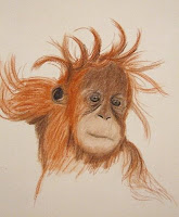
Since I was out of town most of the day, I put together a quick sketch of the baby orangutan at the zoo. I love her messy hair! I'd like to do a more formal drawing of her at some point. I used sepia and sanguine Conte pencils, dark sepia Cretacolor pencil, and a touch of pink tinted charcoal around the mouth. I blended with a tortillon to smooth it all out. Happy Drawing Day!

Tuesday, June 02, 2009

Underwater Rainbow

coral reef colored pencil drawing
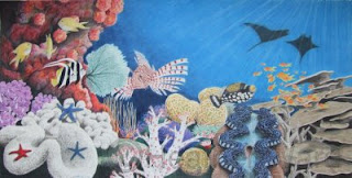
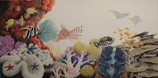
It's been 13 months in the making, and I have finally finished the coral reef. The last step was the water. I used two colors, indigo and true blue, and used the blender like there's no tomorrow. I added sun rays with white.

Altogether, I included two dozen species using 50 different colors. It's been a long 13 months, but I am quite happy with the result. Will I do it again, such a large drawing in colored pencil? I'm not sure. But this was quite the learning experience.

I am going to have this drawing professionally scanned so I can offer large sizes of prints. In the meantime, the original (30"x15") is available:


Friday, May 29, 2009

It's Charcoal - But in COLOR

tinted charcoal colorsA few months ago I discovered an amazing new product from Derwent. They have taken charcoal and mixed it with various clays to produce tinted charcoal. I've tested them out on drawing paper to show the different colors. Most of the colors are very subtle greens, browns and blues.

They definitely have the feel of charcoal, and they blend well. I'm testing out making new colors by layering and blending the existing ones, and it seems to work pretty well. I do wonder how they compare to pastel pencils, as I have not tried those before.

Look forward to some colored works from me in the near future. I already have plans for one drawing and can't wait to get to it (I'll give a hint - it's another primate).

Wednesday, May 27, 2009

Unicorns of the Ocean

I recently read an article in the Smithsonian magazine about narwhals. I had heard about them before, but the article got me thinking about a new drawing. It had to be an underwater scene, of course, so I jumped on the chance to use a colored background. I picked out a smooth, dark blue matboard for this piece and used mostly white charcoal with a touch of black charcoal. I think I'll be adding color like this more often.

Prints are available, and you can purchase the original here:


Tuesday, May 26, 2009

The Colors of Conte

After my experiments with sepia I decided to see what other colors are out there. So far I've picked up these three Conte colors: sepia, bistre, and sanguine. Sepia and bistre are very close, but sepia is just a bit redder. Sanguine looks a bit more like rust. In these samples, the left side is hard pressure, middle is light pressure, and the right is blended with a tortillon.

In a few days I'll have some more colors to show off, from a different brand.

Thursday, May 21, 2009

WIP Reef - Plate Coral, Staghorn Coral, and...

coral reef colored pencil drawing in progress
Wow, I can't believe it, but all the coral and fish are done! In this step I have added three new species: plate coral (Montipora sp.), staghorn coral (Acropora cervicornis), and silhouettes of two manta rays (Manta birostris).

plate coral, staghorn coral, manta rays colored pencil drawing in progressPlate corals are called that because they look like plates (I love how so many corals have such easy names). Some grow so large that they are called table coral. They grow flat to maximize their exposure to sunlight, which aids the symbiotic algae within them. The polyps eat zooplankton in addition to using energy from the algae. The color of plate coral is usually dull, though there are a few colorful species. For these, I used light umber, dark brown, French gray 10%, and olive green, with black for shadows.

Staghorn coral look like deer antlers. Their branches provide protection for many tiny fish. These coral are highly susceptible to changes in their habitats, and will often expel the algae as a stress response. The result is a white coral, called bleached, that is a clear sign of an unhealthy or dying area of a reef. Because these corals in particular are so prone to stress and bleaching, they are highly endangered. I used three shades of French gray to create these corals.

Manta rays are the largest rays. They are filter feeders, feeding mainly on plankton and other tiny organisms, but it is interesting to note that they still retain vestigial teeth. A thick layer of mucous on their skin protects it from injury. Sharks are their main predator. Since the rays here are just silhouettes in the distance, I covered them lightly with black for now. I'll finish them when the water goes in.

So I guess that's it. I'm going to put this aside for a bit while I decide what to do with the water. I have a couple charcoal drawings I've been thinking about lately anyway. So probably the next time you see a post on the reef, it'll be finished!

References:
http://www.poppe-images.com/
http://en.wikipedia.org/wiki/Montipora
http://en.wikipedia.org/wiki/Staghorn_coral
http://en.wikipedia.org/wiki/Manta_Ray

Wednesday, May 13, 2009

WIP Reef - Fairy Basslets

coral reef colored pencil drawing in progressI saw a photo from the Great Barrier Reef with these tiny little orange fish in it, and knew I had to put them in my drawing. I couldn't find out what they were, though, until a trip to the New England Aquarium. These fish are orange fairy basslets (Pseudanthias squamipinnis), apparently an uncommon color based on the number of Google image hits I get, also called sea goldies or lyretail coralfish. They are 3-7 inches long and live in very large schools. So large, in fact, that I think I'll be adding a bunch more to my drawing.

orange fairy basslets, lyretail coralfish, sea goldies drawingAlthough these guys are very small, there is a lot of color packed in each one. I used a base of poppy red on top, limepeel on the belly, deco yellow on the yellow parts, and Spanish orange everywhere else. Tuscan red outlines the eyes with a black center, and the stripe behind the eye is process red. I layered orange on top of the body.

References:
http://en.wikipedia.org/wiki/Pseudanthias_squamipinnis