Monday, June 30, 2008

Hear Me Roar

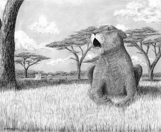
lioness roaringI took some time out of my coral reef to do some charcoal. I had been thinking of this one for some time, and had planned on doing a fur drawing tutorial from it. However, I really don't like how the lioness came out, so I'll have to wait for something else for a tutorial.

This drawing is 17"x14" charcoal on vellum paper. The idea came from the phrase and song title "I Am Woman, Hear Me Roar," hence the female lion roaring. The layout changed dramatically from its conception, from the lioness in complete profile, with a half-background, with just a shadow underneath, etc. I just kept adding features and moving the lion. I'm glad I added the background trees. They are acacia trees from the Serengeti, where lions are prevalent, and drawing them was quite easy. Just a 4B charcoal pencil in sweeping motions for the trunks/branches and in scribbles for the leaves. The distant trees are just scribbles, with 2B vertical strokes here and there to indicate trunks.

The grass is 2B in a random vertical fashion (tip here: blades of grass are not parallel. Keep some randomness in them to make them look real). The sky is a very light layer of 6B in a small circular motion, blended with a chamois that I tried for the first time (love it, by the way). I added the clouds with a kneaded eraser, kind of rolling my wrist around to get a general cloud shape. I added the shadows with charcoal applied with an unsharpened stump.

I am offering prints for a limited time.

Tuesday, June 24, 2008

Drawing Tip #14: In the Right Light

To make a realistic drawing or painting, you have to use the right lighting. Unless you are using several lamps, light basically comes from one direction. I'll put in another plug for the book Drawing Realistic Textures in Pencil. Hillberry has a very nice section on light.

sea turtle drawingFirst thing, you have to be consistent. If it helps, mark on your sketch or references exactly where the light is coming from. In this turtle drawing, the light is coming from just left of straight up.

Next, look at what would be hit by the light strongest - where is the light pointing to directly? These will be the lightest value areas. Also, what is being blocked from the light? These will be your darkest values.

Color affects the value even in black and white. The shadow side of a bright yellow banana, for example, might still be a lighter value than the light side of a dark avocado. In the turtle, the dark shell in full sun is darker than the shadow of her jaw. Texture does this as well. All other things being equal, a shiny surface looks brighter than a rough surface, especially in the highlighted areas. This is because the rough surface diffracts (scatters) the light more, while the shiny surface reflects more.

You have to pay attention to reflected light. This occurs when light reflects from one surface onto another. An area that you might think would be a very dark value might be lighter if there is another surface nearby. Shadows also may be lighter than you think. Because of reflected light, shadows are darkest near the object, then get lighter farther away (but not too light). Take a look at the shadows of the turtle on the sand, especially near the head. You can also see the reflection of the light parts in the wet sand beneath her. This is an example of reflected light.

The best way to learn how to draw light and shadow is to observe it. Look at real objects, look at photos. Try to judge what values are darker than others. Notice what happens under different lighting: direct light, diffuse light, complete shadow, or multiple light sources.

Thursday, June 19, 2008

WIP Reef - Purple Soft Coral

coral reef drawing in progress
This purple coral is the same genus as the red and white one, Dendronephthya. I forgot to mention, thanks to Poppe Images for helping me classify them. As far as I can tell, the purple is pretty much the same as the red, but the polyps are bigger, or maybe just cover more of the support matrix. I found them in the same photo as the red coral.

purple soft coral drawingThe color was pretty easy to figure out. I used lilac burnished with white for the white support matrix and various shades of purple layered with mulberry for the polyps. The purples used were violet in shadow, lilac in highlight, and parma violet in between. I used the burnish pencil for the polyps, too. The dark area behind it is warm grey 90%.

As with the leather coral, I drew in the highlights first, then the midtones, then the shadow, but this time with a circular motion. I then covered with mullberry, and the stalk came last.

References:
http://www.poppe-images.com/

Sunday, June 15, 2008

WIP Reef - Leather Coral and Sea Stars


This photo is roughly the bottom left sextant of the whole piece. It took me about seven hours and consists of three species.

Leather coral (genus Sarcophyton) is another soft coral. It feeds on plankton and consists of hundreds of tiny polyps, which are individual animals. When the polyps are contracted, the coral looks leathery (hence its name), and when they are extended, as in this drawing, it looks fuzzy. They can get up to three feet across. There are two colonies here, the one in the foreground is called a "mushroom" leather coral beacuse, well, that's what it looks like.

This coral was kind of difficult. I chose several colors for the overall structure, planning to draw the shadows around the polyps. This took a lot of scribbling, essentially. It went fairly quickly considering how much area I covered. I used three shades of french grey - 10%, 50% and 90% ('cause that's what I have).

The dark shadow in the corner is a few layers of black and french grey 90%, blended.

Sea stars, or starfish, come in many colors. I have included two here, blue and red. Sea stars grow no larger than a foot across and eat mostly algae and microbes. The mouth is at the center of the animal, and it pushes its stomach out on top of the food to digest it before bringing the stomach back into its body. Usually found with five regenerative-capable arms, they have an eye at the end of each one.

The blue sea stars (Linckia laevigata) are only four colors - a base color of indigo and ultramarine, shadows of black and indigo, and spots of peacock blue and ultramarine - blended with the blender (except the spots).

The red star (Fromia milleporella) is crimson red, with black fading into tuscan red for the shadows (all blended, again). The spots are black.

References:
http://www.sheddaquarium.org/SEA/fact_sheets.cfm?id=103
http://www.getinvolved.qld.gov.au/emblem/ss_star.html

Thursday, June 12, 2008

WIP Reef - Red Soft Coral

I had a heckuva time trying to figure out what this coral was called. It was in one of my general reference photos, and I thought it was so unique I had to include it in my drawing. Well, I needed more than the one tiny photo, so I had to figure out what it was. After pouring through dozens of photos in several databases, I discovered it is a red soft coral, genus Dendronephthya. There are so many species in this genus nobody would list them all (that I could find).

Like hard corals, soft coral is an animal, not a plant. But unlike hard coral, they consist of a group of polyps (the red parts of this one, which are individual invertibrates) and the sclerite, or crystallized calcite, at their base that holds them together. The white part is a flexible "inorganic matrix" of material to support them. Hard corals also have polyps, but they and their structural support are, well, hard. Soft coral primarily feed on algae and plankton.

This coral was actually pretty simple to draw. Once I had the shape, I added the red polyps with crimson red, and where they were in shadow I used tuscan red layered with crimson. They are just tiny dots, really. The white stalk is, of course, not white. Shadow is achieved with slate grey burnished with white. It results in a very slight blue hue.

References:
http://www.peteducation.com/article.cfm?cls=16&cat=1927&articleid=2987

Wednesday, June 11, 2008

WIP Reef - Longfin Bannerfish

The longfin bannerfish, Heniochus acuminatus, are omnivorous saltwater fish that feed mostly on plankton and invertibrates. They can grow to 10 inches long, but I guess these two are still young since they're the same size as the damselfish. They are very similar to the moorish idol (Gil from Finding Nemo), differing visually by an extra stripe on the tail and more yellow on the sides of the idol.

The black stripes on these guys are actually black, with a touch of white on the forehead area for a highlight. The yellow fins are olive green topped with deco yellow and yellow ochre. The cheeks are lilac with metallic silver and white and the rest of the white areas are metallic silver. The eye is black with a small metallic gold ring around it. The long dorsal fin will remain untouched paper, which is why you can't see them very well. They took just over an hour.

References:
http://en.wikipedia.org/wiki/Longfin_Bannerfish

Tuesday, June 10, 2008

WIP Reef - Yellow Damselfish

The damselfish is a class of marine fish commonly found in coral reefs. At about 3.5 inches long, they feed primarily on algae and planktonic crustaceans. There are several species and colors, such as cocoa, four-stripe, white spotted, blue, and this yellow. They are popular in tropical aquariums.

These little yellow fish (Pomacentrus moluccensis) are so brightly colored I wanted to put them in a dark area of coral so they stand out (the coral will come in much later). I played around with colors for a while, and eventually came up with the following set. First I added shadow with olive green. Then I went over that and added midtones with yellow ochre. To the midtones I added deco yellow and also used deco yellow for highlights. I blended with the blender and burnished everything with cream. The white underbelly consists of various shades of warm grey and the eye is black. I then added a hint of scales with warm grey 90% all over. All three little guys took me about two hours.

References:
http://en.wikipedia.org/wiki/Damselfish

Monday, June 09, 2008

WIP Reef - Construction of the Giant Sea Clam


After I finished the layout, I knew I wanted to color the giant sea clam first. There are several species worldwide, but this one is Tridacna gigas, a threatened (or vulnerable) species. These clams are amazing. They can get as big as four feet across and 500 pounds! Their insides (mantle) get their markings by the algae that live symbiotically in them. The clam opens up during the day to give the algae sunlight to make food, and the algae give the clam part of its food. It gets the rest from syphoning water in and out of its water chamber. They move very slowly, and it would be unlikely that you could get your foot caught in one (unless you were oblivious to what was happening) like that urban legend.

I used several reference photos, including one for general position, one for the water outlet syphon, one for the colors of the mantle, one for the colors of the shell, and one for the texture of the shell.

I started with the rim. I drew the light blue lines first, using ultramarine topped with light cerulean blue (see image, lower left quadrant). The dark surrounding color is black (upper left) layered with violet-blue (upper right), the highlights are indigo layered with ultramarine (lower left again). I went over it all with a blending pencil (lower right). I then added highlights to the blue lines with white and the dark spots on the rim with black.

The water outlet syphon consists of four colors. The deepest shadow is cold grey 90%, the medium value is french grey 90%, and the pink color is achieved by a light layer of aquamarine topped with a hard layer of blush pink. The water inlet syphon is on the other side and cannot be seen from this angle.

Next I completed the inside tissue. I decided to start with the many tiny dark spots (ultramarine with black), then filled in around them. Midtones were achieved with peacock blue, shadows with black and peacock blue, and highlights with true blue. In the photo, I had filled in most of the highlights and black shadows. I then filled in the peacock blue and went over it all with the blender (incredible tool, by the way), avoiding the spots.

It's important to have very sharp pencils for this. Especially working in between the tiny spots and lines.

On to the shell. Most of what we see is in shadow. I add a heavy layer of black under where the mantle hangs over, then top it off with tuscan red and a touch of indigo. The base color for the rest is a very light layer of light cerulean blue topped with a hard layer of peach and a light layer of tusan red and dark green, alternating with burnt ochre, light umber and dark umber in an irregular curved stripe manner. I added white for highlights. I did not use a blender in order to keep the rough texture. The photo shows the bottom layer (top), middle layer (middle) and a finished section (bottom). The unusual white space to the right will be filled later with coral.

And here is the final clam after eight hours.


References:
http://en.wikipedia.org/wiki/Giant_clam
http://www.richard-seaman.com/Underwater/Australia/GiantClams/
Friday, June 06, 2008

Drawing Tip #13: Color Picker

Having a hard time trying to figure out exactly what color you need for a drawing or painting? If you are working from reference photos, there's an easy way I just discovered. All my reference photos, even ones I took myself, are digital. I use Linux primarily, not a Mac (though I do have one) and definitely not Windows. I also don't like to pay for software. Thus, I was ecstatic when my husband introduced me to Linux and open source software. Read: FREE (legally!). Instead of the pricey Photoshop I used to use (and still do occasionally), I now use the free GIMP which does almost everything that Photoshop does. GIMP is available for Mac and Windows, too.

Anyway, if you have software like GIMP or Photoshop that has a color picker (usually a little eyedropper icon), just use that to find out what color you are looking at. You can even see what proportions of red, green and blue make up that color. It was this way that I discovered that the pink I was looking at actually had quite a bit of green and blue in it. I layered aquamarine and blush pink and got just what I wanted. Until I learn how to pick these colors out with my naked eyes, I'll be using the color picker on my computer.

By the way, you can use this for black and white, too. Convert your color images to grayscale, then use the eyedropper tool to see what values you need.

Wednesday, June 04, 2008

WIP Reef Update - Layout Complete

Good news, I was able to pick up some extra paper last weekend. The layout is now complete, taking two hours (not counting redrawing on the new paper). I got so into drawing the coral I almost forgot the fish! I made some minor changes to the sketch, but for the most part it looks pretty much the same. I'd love to show it, or part of it, but the layout is so light it would never show up on the computer.

I debated a bit of how to proceed from here, like left to right, top to bottom, but ultimately decided to go from foreground to background. So it'll be mostly bottom to top. Colored pencil doesn't smudge like graphite or charcoal. And I'm going to attack the giant sea clam first. As I finish each species, I'll post a closeup and description of it, and maybe some in-progress photos, too.

Well... Here goes nothing!

Monday, June 02, 2008

Nightstalker

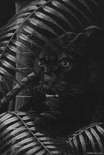
black leopard hunting at night drawing with white charcoalHere is the black leopard, a nocturnal hunter with a wide range of habitats. Here, one is hunting in the moonlit rainforests of southern Asia (if you can imagine moonlight actually getting to the ground in a rainforest). The black, or melanistic, leopard is just a color variation of the "regular" leopard. It is not completely black, as you can usually see the spots.

This drawing was quite a challenge for me, but I enjoyed it. Except for the experiments of my previous posts on white charcoal, I've never used black paper and white charcoal before. It is a whole new experience drawing highlights instead of shadows. It was fun, too, trying to figure out where all the shadows of the leaves would lie, especially without a physical model to go by.

I used the paper I was complaining about before. I really don't like the patterned tooth, but I was able to work with it reasonably well, especially for the tree trunks. I still would have preferred smoother paper for the leaves, as you can still see some texture to them. The fur worked pretty well. I bought a couple sheets of Strathmore Artagain black paper to try out. It is recycled paper but is much smoother than this charcoal paper.

I have prints available for this piece, and I'll be selling the original unframed (12"x18").

Animal Rescue

A fellow animal artist has recently been promoting a series of photographs from Noah's Lost Ark, a wild animal rescue facility. They have rescued many animals from certain death, and provided homes for others who would have lost theirs. They have taken in old circus tigers, big cats from breeding facilities that closed down, and others from owners who just couldn't handle them any longer. Read some of their heartwrenching tales of rescues, animals who, fully grown, weighed only 1/3 of their species' normal weight because of malnourishment, or who were beaten to blindness or kept in cages so small they have permanent skeletal damage.

The owners are incredible people to take in all these animals, but they only get funding from donations and the tours they give. Take a moment to look at their website and see if you can help in some way.